Visualizing Vehicle Routing with Leaflet and Google Maps

After OptaPlanner (now Timefold) finds the best solution for a Vehicle Routing Problem, users usually want to see it on a real map, such as Google Maps or OpenStreetMap. The optaplanner-webexamples.war for OptaPlanner 6.3 now demonstrates that.
Visualization
In the case below, I’ve solved a VRP problem with 50 locations and 8 vehicles and projected the best solution with Leaflet and Google Maps. It’s a case of capacitated vehicle routing: each vehicle can carry 100 items and each location needs a number of items picked up.
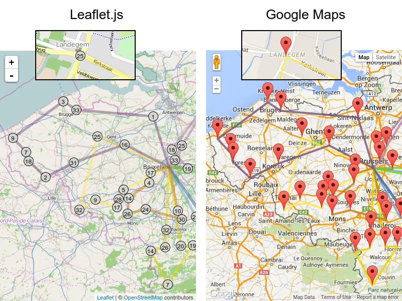
Despite that the lines are shown as straight between locations, actual road distances were used in the optimization calculations. In total, the vehicles drive a little under 32 hours, so on average 4 hours per vehicle (includes location service time). This solution doesn’t take into account rush hour yet, but if such traffic prediction data were available, we can make OptaPlanner apply that too, which could result in a different best solution.
In the web UI, we can zoom in on a specific location, such as the Landegem town center, where we need to pickup 25 items. In this solution, those items are picked up by the yellow vehicle.
The visualization was implemented in 2 different ways:
Leaflet.js
Leaflet.js is an open source JavaScript that uses OpenStreetMap data.
Google Maps
Google Maps is a proprietary JavaScript that uses Google data.
Apply it now in your case
If you’re using the latest OptaPlanner final release (6.2.0.Final at the time of writing), you easily do such visualization too: those webexamples don’t require any APIs new in optaplanner-core 6.3, so download the nightly snapshot and look for webexamples/sources to see how it’s done.
Update
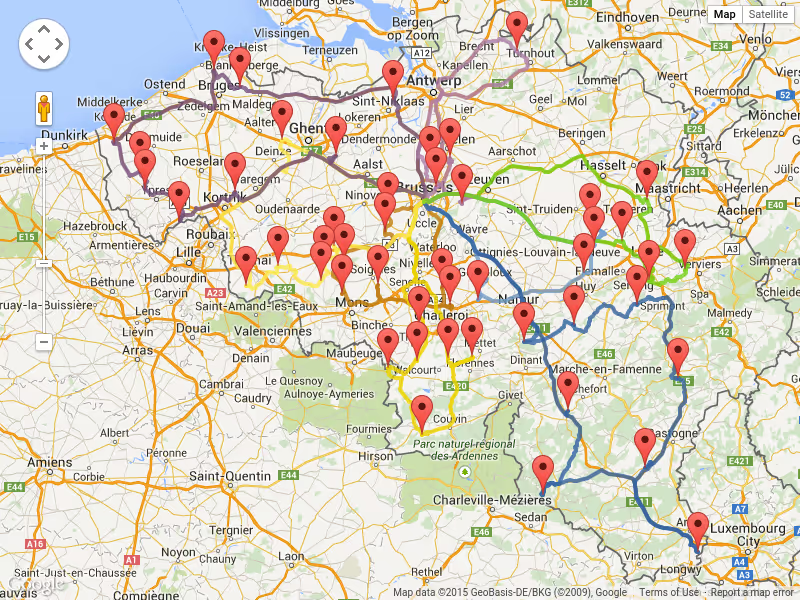
With Google Map Directions we can also visualize the actual roads used:

Technician scheduling software in 2027: Essential capabilities for modern field service
Technician scheduling software assigns field technicians to jobs and plans their days so that the right person, with the right skills, arrives within the promised window without wasting hours on the road.
The best tools do this automatically across hundreds or thousands of technicians, and they keep the plan valid as the day changes.
Most products in this category show a calendar and a map. The difference between them is what happens underneath: whether the software can weigh skills, time windows, SLAs, travel, and working-hour rules together, or whether it leaves those tradeoffs to a dispatcher.
This guide lists nine capabilities that separate modern technician scheduling from a digital whiteboard. It's written for operations leaders comparing tools and for product teams at field service software companies deciding what their own scheduling engine needs.
Why technician scheduling has become harder
Two pressures are pushing field service teams to rethink how they schedule.
- The first is labor. In the US HVAC trade alone, industry estimates put the technician shortage at around 110,000 open positions. When every skilled technician counts, a schedule that wastes an hour of their day on avoidable driving is a real capacity problem.
- The second is expectations. Customers expect narrow arrival windows, live updates, and a fix on the first visit. Nobody wants to be anticipating their technician coming in all day.
Both pressures land on the schedule.
Nine essential capabilities
1. Skill and certification matching
The software should know what each job requires and what each technician can do, including certifications, seniority, languages, and equipment access. Hard requirements (a gas-safe certificate) should never be violated. Softer preferences (a technician the customer has worked with before) should be encouraged but not forced.
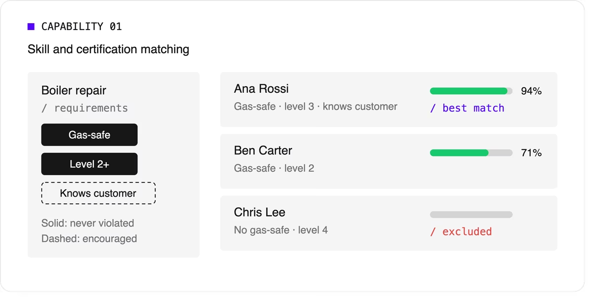
Look for support for skill levels and customer affinity in addition to simple yes-or-no skills. Matching the right skills is also one of the most direct ways to improve first-time fix rates.
2. Time windows and SLA priorities
Jobs come with customer availability windows, and many come with contractual deadlines.
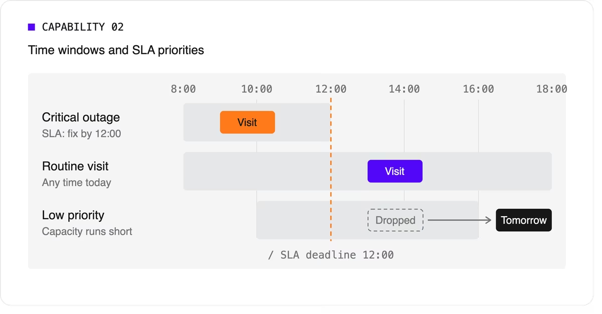
The software needs to treat a critical SLA differently from a routine visit that can move to tomorrow. That means supporting multiple time windows per job, priority levels, and deadlines that can push lower-priority work out of the plan when capacity runs short.
3. Travel-aware planning with real road data
A schedule that assumes straight-line distances will fall apart on the road. Technician scheduling software should use real travel times, ideally with support for traffic patterns and your own map provider if you already have one.
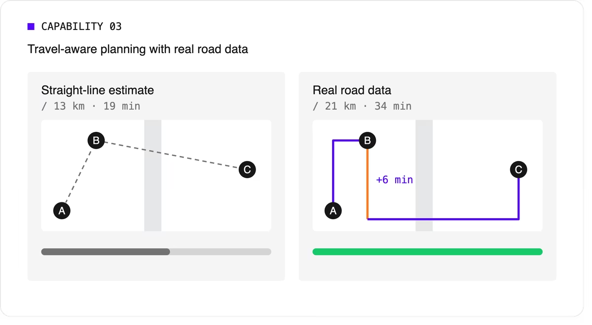
It should let you choose what to minimize, total travel time or total distance, because the two goals give different answers.
4. Multi-technician visits and job dependencies
Some jobs need two or more people on site at the same time for safety or lifting. Others must happen in order, sometimes with a delay: isolate the power before rewiring, or let a surface dry before painting.
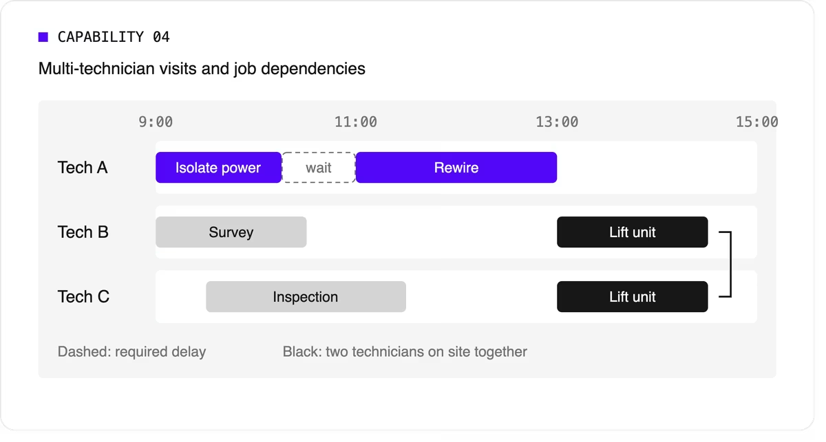
Many tools can't express these rules, so dispatchers track them by hand. If your operation has them, this capability is non-negotiable.
5. Working hours, breaks, and fairness
The plan has to respect shift start and end times, mandatory breaks, maximum working hours, and overtime rules. It should also spread work fairly so the same technicians don't always get the long days or the difficult jobs. Fairness affects retention, and retention matters more when technicians are hard to replace.
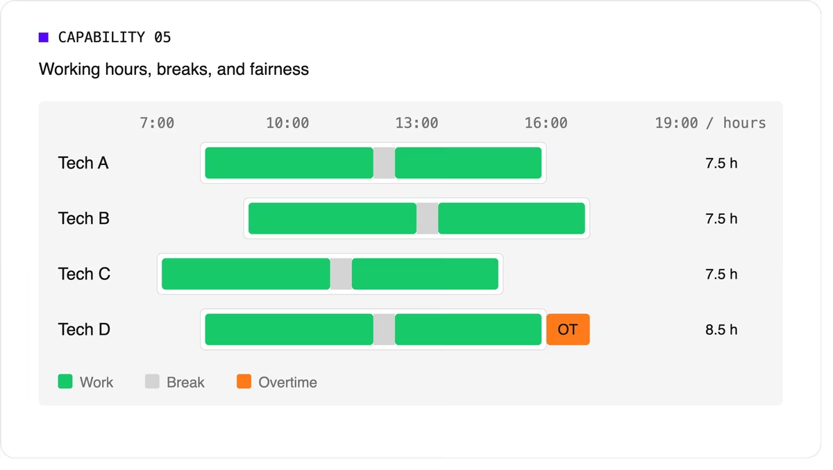
Scheduling software can support labor-law-style rules as constraints, but your organization remains responsible for verifying compliance with the regulations that apply to you.
6. Real-time replanning
Every schedule meets reality by mid-morning. A technician calls in sick, a job overruns, or an urgent call comes in. The software should replan quickly while changing as little as possible for everyone else. It should also let dispatchers lock (pin) jobs that are already in progress or confirmed with the customer.
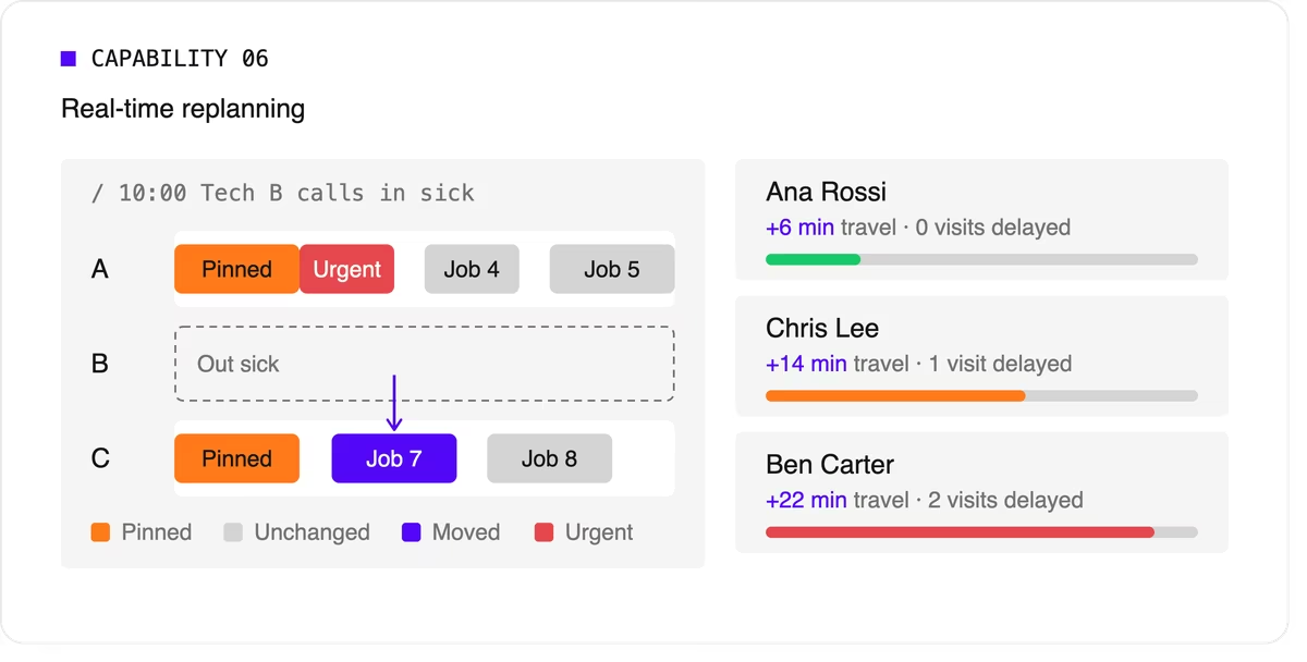
A strong version of this capability also recommends options. When a new urgent job arrives, the dispatcher should see which technicians could take it and what each choice would cost in travel or delayed work.
7. Explainability
Dispatchers and managers won't trust a plan they can't understand. Good technician scheduling software shows why a job was assigned the way it was, which rules were bent, and why some jobs couldn't be scheduled at all.
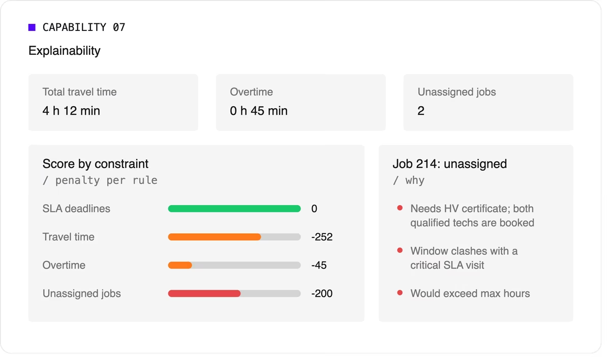
Look for a breakdown by constraint and clear metrics such as total travel time, overtime, and unassigned jobs.
8. Configurable priorities
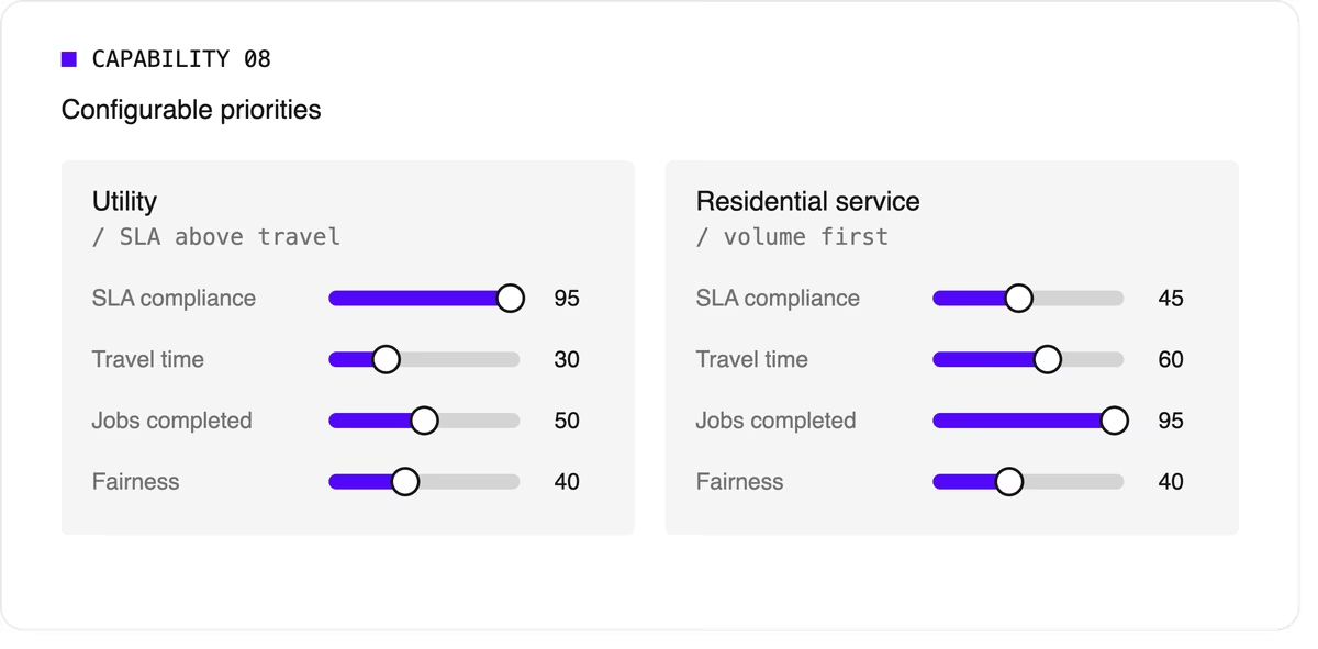
Every operation weighs its goals differently. A utility may put SLA compliance far above travel savings, while a residential service company may care most about completing as many jobs as possible per day. The software should let you adjust the relative weight of each goal without rewriting the underlying logic.
9. Integration and scale
Scheduling doesn't live on its own. It needs job data from your FSM or work order system, technician data from HR or workforce tools, and a way to push the finished plan to mobile apps. An API-first design makes this far easier than a closed tool with a separate interface.
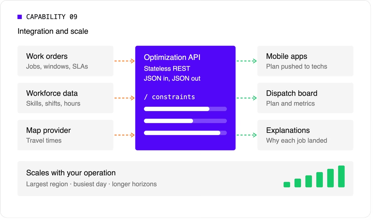
Scale matters too. The software should handle your largest region on your busiest day, and it should keep up as you add technicians, regions, or longer planning horizons.
A quick evaluation checklist
Use this table when comparing technicians scheduling software options or reviewing your own engine.
Scheduling software, FSM platform, or optimization engine?
When people search for technician scheduling software, they find three kinds of product.
- FSM platforms with a built-in scheduler cover the full workflow: work orders, mobile apps, invoicing, and scheduling. Their scheduling depth varies widely, from drag-and-drop boards to real optimization.
- Standalone scheduling tools focus on the dispatch board and often add basic auto-assignment. They're quick to adopt but can struggle with complex constraints.
- Optimization engines sit behind a user interface and do the heavy lifting. They don't manage work orders or invoices. Instead, they take in jobs, technicians, and rules, and return an optimized plan through an API. FSM vendors often embed one to strengthen their own scheduling, and large enterprises use one to add optimization to systems they already run.
Where Timefold fits
Timefold is an optimization engine in the third group. The Timefold Field Service Routing model covers the capabilities above: skill and seniority matching, customer time windows, visit dependencies with delays, multi-technician visits, working hours and fairness, and real-time replanning with recommendations. It ships with 50+ pre-configured constraints with adjustable weights, and every plan comes with metrics that show the tradeoffs it made.

It connects through a stateless REST API, so it fits alongside the FSM or work order system you already use. To see how this applies to field teams specifically, read about route optimization for field technicians. If you're preparing to integrate, the data foundations of efficient field service walks through the data you'll need.
FAQ
What does technician scheduling software do?
It assigns jobs to technicians and plans each technician's day, taking skills, time windows, travel, and working hours into account. More advanced tools optimize the whole plan at once and replan automatically when things change.
What's the difference between technician scheduling and dispatching?
Technician scheduling creates the plan ahead of time. Dispatching sends technicians to jobs and manages changes during the day. Modern software blends the two by replanning continuously.
Do I need technician scheduling software if I have an FSM platform?
It depends on how deep your FSM's scheduling goes. If dispatchers still spend hours adjusting assignments by hand, or your FSM can't express rules like dependencies or multi-technician visits, an optimization engine behind your FSM can close the gap.
How many technicians do I need before scheduling software is worth it?
There's no fixed number. Complexity matters more than headcount. A team of 20 with several skill types, tight SLAs, and multi-technician jobs can benefit as much as a team of 200 with simple, uniform work.

Field service scheduling: how to balance jobs, skills, SLAs, and travel
Field service scheduling is the work of deciding which technician does which job, when, and in what order.
Done well, it balances four competing forces at the same time: the jobs that need doing, the skills required to do them, the service-level agreements (SLAs) you've promised customers, and the travel between locations.
Done badly, it produces missed arrival windows, repeat visits, overtime, and technicians who spend more of their day driving than fixing.
This post is for operations leaders, dispatch managers, and product teams at field service software vendors. It explains why these four forces pull against each other, why spreadsheets and drag-and-drop boards stop coping as you grow, and how constraint-based optimization turns the balancing act into something a system can solve.
What is field service scheduling?
Field service scheduling assigns customer visits to technicians and places each visit at a specific time in a technician's day. It's closely tied to routing, which decides the order of visits and the path between them. In practice, you can't separate the two: a schedule that ignores travel isn't achievable, and a route that ignores skills or time windows sends the wrong person at the wrong time.
That's why modern tools treat field service scheduling and routing as a single problem, just like our Field Service Routing API does. In operations research terms, it's a variant of the Vehicle Routing Problem with extra rules layered on top.
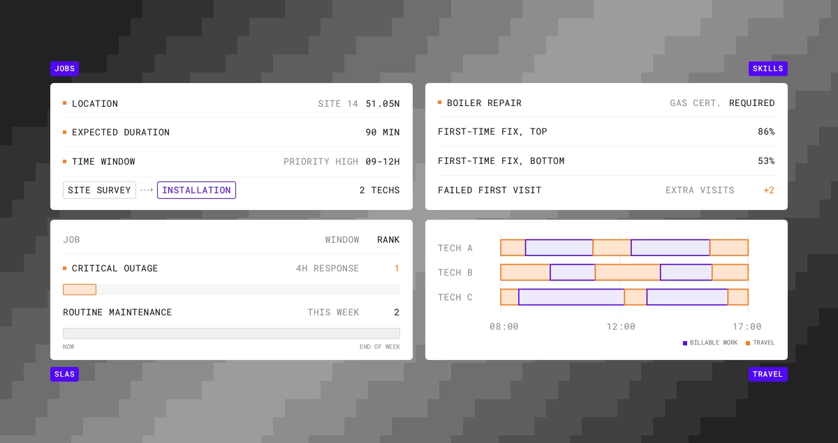
The four forces you're balancing
Jobs
Every job has a location, an expected duration, a priority, and often a window when the customer is available. Some jobs depend on others, such as a site survey before an installation, or an electrician isolating power before a second technician starts work.
Some need two or more technicians on site at the same time.
Skills
Technicians aren't interchangeable. A boiler repair may need a gas certification, a network install may need a specific vendor accreditation, and a senior technician may be required for certain customers.
Skill matching has a direct effect on outcomes. Aquant's 2025 Field Service Benchmark Report, based on data from nearly 160 service organizations, found that top performers reach an 86% first-time fix rate while bottom performers sit at 53%. The same report found that a failed first visit leads to two additional visits on average.
Sending the right skills the first time is one of the biggest levers a scheduler controls.
SLAs
SLAs turn some jobs into commitments with deadlines, and some into commitments with penalties. A four-hour response for a critical outage outranks a routine maintenance visit that could happen any day this week. The schedule has to know the difference, and it has to keep knowing it as new work arrives.
Travel
Travel is where capacity quietly disappears. Every minute on the road is a minute not spent on billable work, and it also drives fuel cost, emissions, and technician fatigue.
Travel is also the force most affected by the other three.
Honoring a tight time window or sending the one qualified technician across the region both cost travel time.
Why the balance breaks down
A dispatcher with 12 technicians and 40 jobs can usually build a reasonable day by hand.
They know the people, the regions, and the regular customers.
Grow that to 80 technicians and 500 daily visits and the picture changes.
Now the dispatcher is weighing skills against availability, promised arrival windows against drive time, overtime limits against SLA deadlines, and all of it against the three jobs that just came in and the technician who called in sick.
The number of possible schedules grows faster than any person, or any simple rule, can evaluate. Timefold's field service routing optimization guide points out that for 50 technicians and 200 jobs, the number of possible schedules exceeds the number of atoms in the observable universe.
Rule-based auto-assignment ("nearest available technician with the right skill") helps, but it makes one decision at a time. It can't see that giving the nearest technician this job leaves nobody qualified for the urgent job an hour later. Field service scheduling at scale needs a method that evaluates the whole plan at once.
How optimization handles the tradeoffs
Constraint-based optimization describes the scheduling problem as a set of rules and goals, then searches for the plan that scores best against them.
Timefold uses three levels of constraints, described in its Planning AI concepts documentation:
- Hard constraints are rules that can't be broken, such as a technician's shift hours, a required certification, or the fact that a person can only be in one place at a time. Breaking a hard constraint makes the plan infeasible.
- Medium constraints handle shortages. When there aren't enough technicians for every visit, they push the model to assign as many visits as possible, starting with the most important.
- Soft constraints express business goals, such as minimizing travel time, reducing overtime, respecting technician preferences, or finishing high-priority visits early.
Each constraint has a configurable weight. That's how you tell the model what matters more when goals collide.
If SLA compliance matters more than travel savings, you weight it higher, and the model will accept a longer drive to meet a deadline. If fairness matters, you add a constraint that balances workload across the team.
You stop encoding decisions ("always send the closest technician") and start encoding priorities. The model then makes thousands of decisions consistently against those priorities. At a much larger scale than a human ever could.
A worked example
Imagine a facilities maintenance company with 40 technicians and 280 visits scheduled for Tuesday. Six technicians hold high-voltage certification. Twenty visits have four-hour SLA windows, and the rest are flexible within the day.
At 09:30, a hospital reports a critical electrical fault with a two-hour SLA.
The closest certified technician is midway through a routine inspection that could move to the afternoon.
A manual dispatcher has to find a technician, check whether moving the inspection breaks another commitment, then check whether the technician who picks up the inspection still makes their own windows.
An optimization model evaluates those knock-on effects together. It can propose moving the inspection to a technician with spare capacity nearby, keep everyone else's morning intact, and show the cost of the change in added travel minutes.
The dispatcher still makes the call. They just make it with the full picture in front of them.
How to measure whether field service scheduling is working
Track a small set of metrics that reflect all four forces:
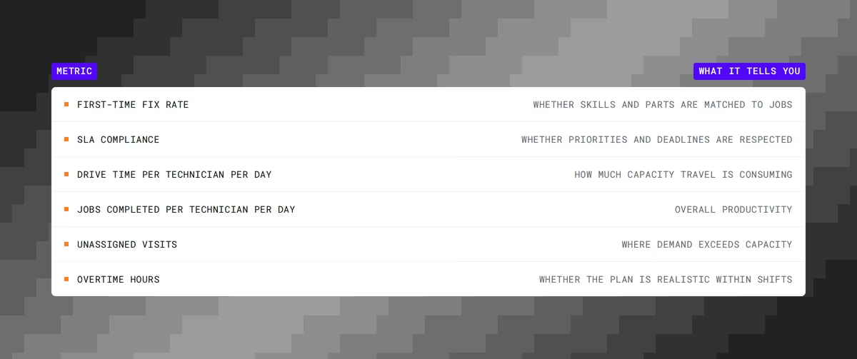
Consider these KPIs not separatly, but holistically.
A team can post excellent drive-time numbers by skipping hard-to-reach customers, or strong SLA compliance by burning overtime. Good field service scheduling improves the set as a whole without trading one number off against the rest.
Where Timefold fits
Timefold builds optimization engines for scheduling and routing problems.
It works as the optimization layer behind field service management (FSM) platforms and in-house systems, rather than replacing them.
The Timefold Field Service Routing API assigns visits to technicians and sequences their routes while respecting time windows, skills, visit dependencies, multi-technician visits, and working hours. It ships with 50+ pre-configured constraints, each with adjustable weights, and it replans in real time when the day changes.
FSM vendors and enterprises call it through a REST API from their existing systems.
Organizations using constraint-based routing optimization typically see 25 to 35% less technician drive time, according to Timefold deployment data published in the optimization guide. If you're evaluating this for your own team, the route optimization for field technicians page explains the use case, and the Field Service Routing documentation covers the constraints in detail.
FAQ
What's the difference between field service scheduling and dispatching?
- Scheduling builds the plan: who does what, when, and in what order.
- Dispatching executes it and handles changes during the day.
With real-time optimization, the line blurs, because the plan is continuously updated as dispatch events arrive.
Is field service scheduling the same as routing?
They're separate decisions that depend on each other. Scheduling assigns jobs and times, and routing decides the sequence and path. Solving them together produces plans that are both feasible and efficient.
When does manual field service scheduling stop working?
There's no fixed threshold, but the signs are consistent: dispatchers spend most of their day re-planning, SLA misses rise as volume grows, and adding technicians doesn't add proportional capacity. These usually appear once you have dozens of technicians, several skill types, and customer time windows.
Can I keep control over the schedule if I use optimization?
Yes. You set the priorities through constraint weights, you can lock (pin) visits you don't want moved, and you review the proposed plan before sending it to technicians.
How System One Models like Jev complement planning optimization
Over a year ago I wrote about cats riding crocodiles and playing the banjo, and used that as an excuse to explain why LLMs can't solve your planning problems. The short version: LLMs predict the next token, and "the next token" is not the same thing as "the optimal shift schedule for ten nurses across a week" or "the optimal routes 50 trucks need to drive to deliver 600 parcels".
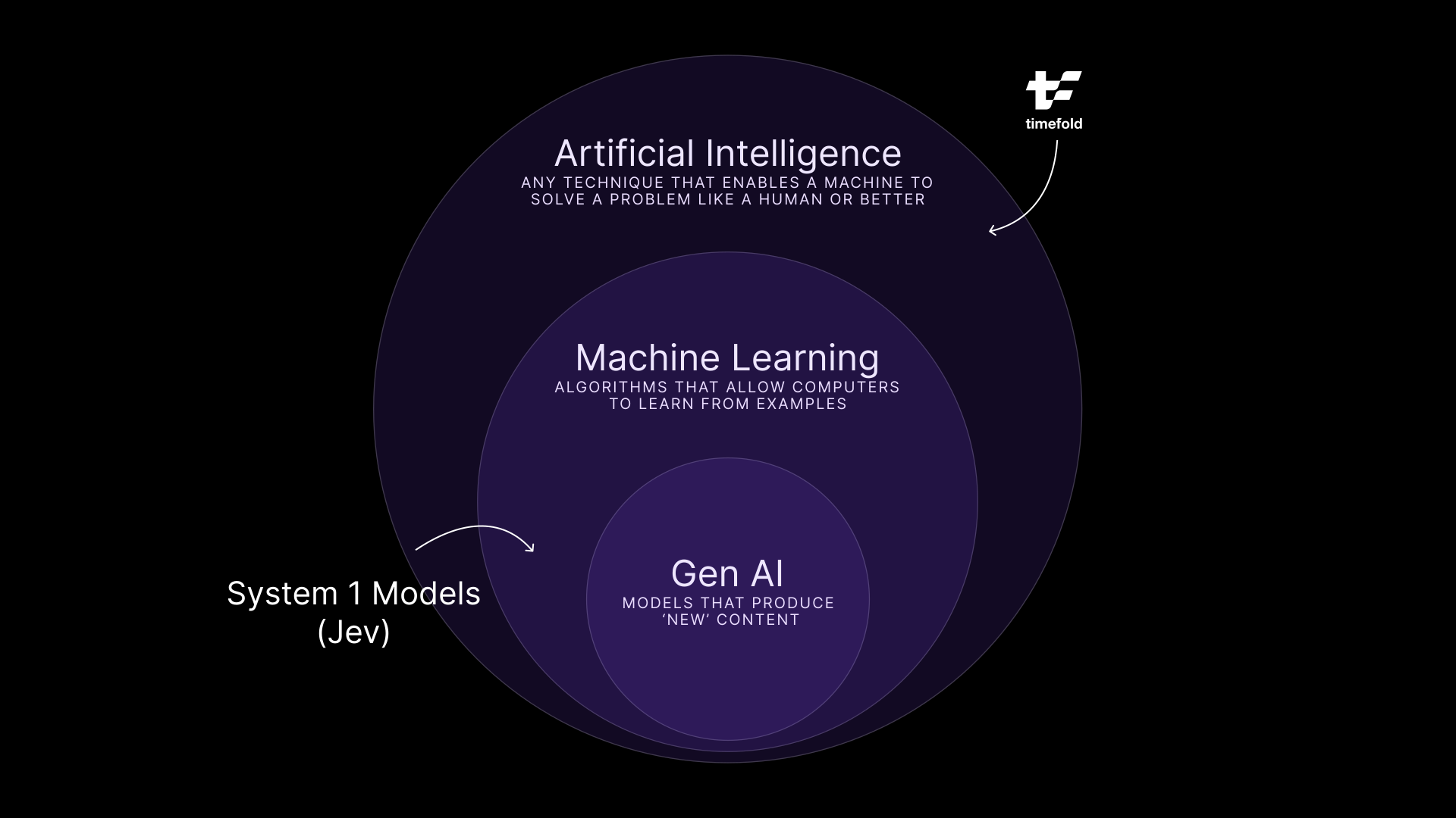
I drew a picture of AI as a set of nested circles, with GenAI in the middle and our kind of AI, mathematical optimization, sitting in the outer ring people seem to forget exists.
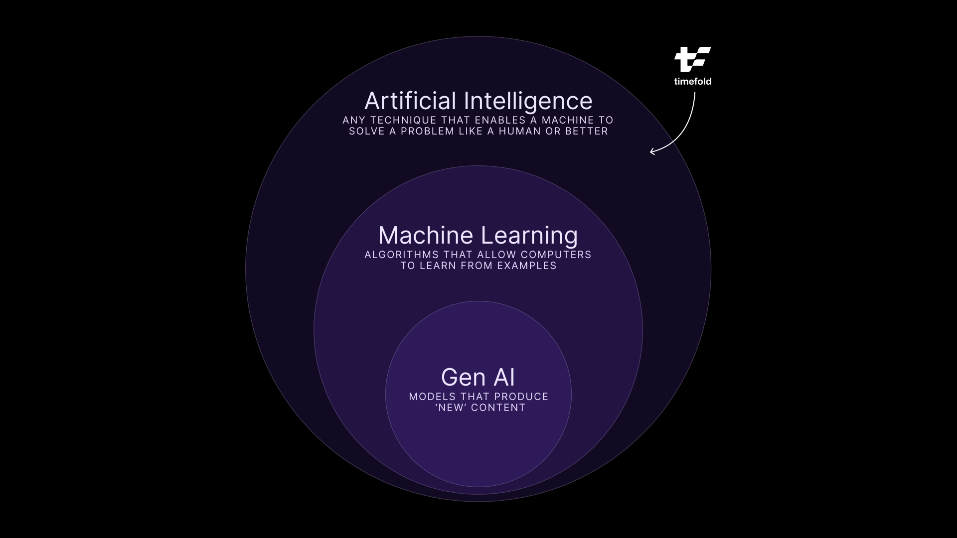
With the recent introduction of Jev, I wanted to revisit that drawing.
A model that refuses to talk
If you haven't seen it yet, Jev comes from a startup called TypeSafe AI, founded by a former OpenAI researcher named Diogo Almeida. Jev's pitch is that it won't write you an email, a poem, or a paragraph explaining its reasoning. Then what does it do? Give it an input and a set of pre-defined options, and it hands back a choice, a score, or a yes or no, each with a calibrated probability attached.
"Decisions, not strings." - TypeSafe's tagline
They call it a System One Model, borrowing the term from Kahneman's fast, intuitive System 1 thinking. If you have never heard about this, the book is a pretty good read!
The world noticed. Top of Hacker News for a day, a launch post with millions of views, TypeSafe claiming their model is up to 193 times faster and 444 times cheaper than a comparison LLM on the tasks it's built for. Whether those exact numbers hold up under independent testing is still an open question, and I'd treat "444 times cheaper" the way I treat any number a company publishes about its own product: interesting but might just be fluffy marketing numbers.
Yet, I'm intrigued by Jev, because it matches my perspective about GenAI and the wider AI ecosystem.
Appending my initial image
For a while, I didn't have a cool new hip example for the Machine Learning circle in my diagram. Yes, you can train neural networks to recognize anything, but it always felt a bit "fuzzy". But Jev resolves this issue nicely.
Jev is absolutely Machine Learning. It's trained, it's probably transformer-based, and TypeSafe has a whole reinforcement learning process behind it (they call it RLCD, reinforcement learning for calibrated decisions). So it lives inside the ML circle, same as GenAI does.
But it's not GenAI. GenAI is generative, it produces novel (for some definition at least) content, token by token, and that's precisely the thing Jev does not do. It picks from a fixed menu of answers instead of writing a new sentence every time.
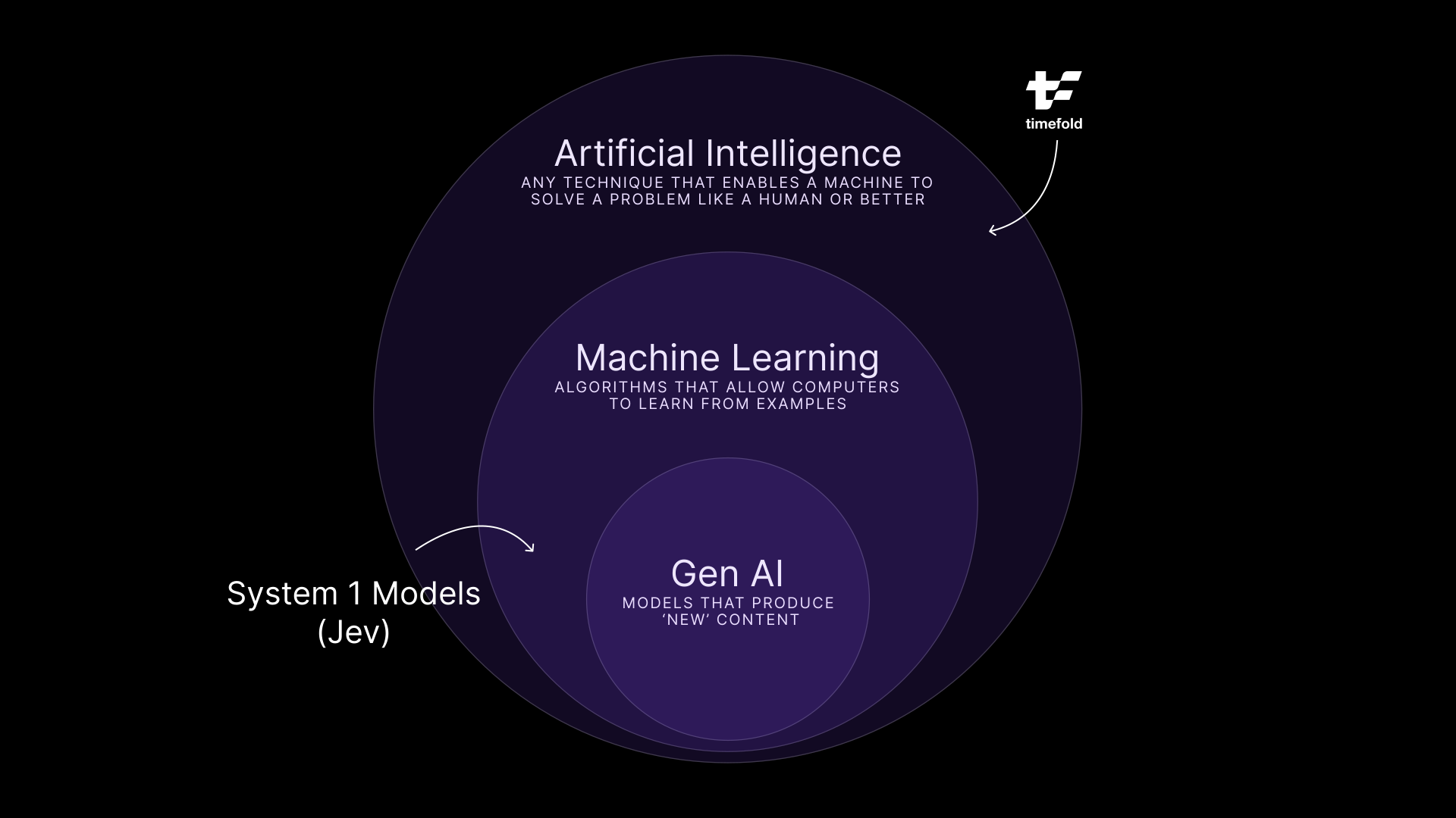
Finally a new cool kid on the Machine Learning block!
AI can solve any problem, not just GenAI
I've been preaching for a while that I feel the industry is overly focused on GenAI and is ignoring very valuable technologies in the broader AI space. With Jev, that is made even clearer. Not everything should be solved with GenAI, use the right tool for the job.
But where does it fit when we're talking about planning optimization, sort of our thing at Timefold? I personally believe that, despite it may seem that it makes "decisions" the way planning optimization does, that is somewhat incorrect. It can't do complex planning optimization, but it is a good complement to a tool like Timefold.
A Timefold model wants clean, structured input. Which technician has which certification. How urgent this job is. How long that visit will take. In the real world, that data has much messier origins: a customer's email, a technician's scribbled note, an inbound ticket that says "urgent!!" three times. Somebody, or something, has to turn that mess into structure before a solution like Timefold's can do anything with it.
That "somebody" today is often a person doing manual triage, or an expensive LLM call burning tokens to generate a sentence nobody reads. That second option is exactly where Jev makes a difference. A decision model can sit upstream of a Field Service Routing model, for instance, and classify each incoming ticket (urgency: low, medium, high; skill required; SLA risk) in well under a second, much faster and cheaper than an LLM can. Jev decides what the ticket means. Timefold decides who goes where because of it.
curl $JEV_URL \
  -H "Content-Type: application/json" \
  -d '{
    "state": {
      "customer_type": "hospital",
      "equipment": "Commercial HVAC unit serving the east wing",
      "service_contract": "premium",
      "task": "The AC in the east wing stopped working this morning. Patients are uncomfortable."
    },
    "questions": {
      "urgency": {
        "type": "choice",
        "instructions": "How urgently does a field service technician need to handle this task?",
        "criteria": {
          "HIGH": "Safety risk, complete system outage, critical or vulnerable site (hospital, data center), or major business disruption. Dispatch immediately.",
          "MEDIUM": "Degraded performance or a partial failure that affects operations but has a workaround. Schedule within 24 to 48 hours.",
          "LOW": "Routine maintenance, cosmetic issues, inspections, or minor problems with no operational impact. Schedule at the next available slot."
        }
      }
    }
}'The code snippet above is an example call towards Jev, where a certain state is passed in, as well as the question we want it to answer. In this case, we want to extract the urgency of a task for a field service technician. In return, we get the confidence levels for each of the options. In this case, the answer is pretty clear and both the confidence level and the resulting urgency is high.
{
  "answers": {
    "decision": {
      "type": "choice",
      "choice": "HIGH",
      "probabilities": {
        "HIGH": 0.99,
        "MEDIUM": 0.01,
        "LOW": 0
      }
    }
  },
  "usage": {
    "inputTokens": 388,
    "outputTokens": 39,
    "totalTokens": 427
  },
  "confidence": {
    "decision": 0.99
  },
  "warnings": []
}
Yes, an LLM could do such a clarification as well… but much slower and much more expensive. It's just not the right tool for a task like this.
This doesn't mean that LLMs are completely out of the picture. When it comes to structuring data or reasoning, LLMs still reign supreme.
So in the end, nothing much has changed when it comes to planning optimization. The optimization still has to be the optimization, provably feasible, reproducible, defensible to a dispatcher who's going to ask why. But the road getting to a clear dataset just got a lot easier.
Brand shiny new, not fully settled
Jev is a week old as I write this and its announcement is still reverberating through the industry. We are all still searching where it is strong and where it falls flat. There is a lot of hype right now and most of what we know about it comes directly from TypeSafe themselves, so we must take their data with a grain of salt until it's been verified. Additionally, open source alternatives like Laya are already popping up, so it's going to be interesting times moving forward.
This might be a big dose of confirmation bias, but I love seeingmore forms of "intelligence" pop up that are part of the AI sphere, but are explicitly not GenAI. I still believe that AI can solve any problem… but it is so much more powerful if different forms of AI, Planning Optimization + System 1 Models + GenAI, get combined together.

MTTR, CSAT, SAIDI, and SAIFI? How scheduling and routing optimization drives customer satisfaction in field service
It's 8 PM, and a customer's power has been out since a summer storm rolled through that afternoon. The utility estimated power would be back hours ago. No crew has arrived, and the utility has sent no updates.
To the customer, it feels like the company has forgotten they exist. But the outage did not become a customer service problem when the lights went out. These issues are a systematic result of rigid systems and manual dispatching.
If you lead a field service operation, that is the practical takeaway of this article: most customer satisfaction failures in field service are scheduling failures. Slow repairs, missed arrival windows, and silence all trace back to routing and assignment decisions made before a crew left the depot. This article follows that chain from dispatching to the four metrics leadership answers to, and explains what actually has to change to move them.
How are field service scheduling and customer satisfaction connected?
Scheduling is one of the biggest drivers of customer satisfaction in field service, and the link is easy to miss because the two live in different reports. Scheduling shows up in operations dashboards, while satisfaction is hard to surface. Indications of satisfaction do show up in survey scores (like the CSAT score) and regulator filings, but who actually conducts those? To gain insights in how happy customers are, field service companies look at objectively measurable metrics like Mean Time to Repair (MTTR), First Time Fix Rate (FTFR), System Average Interruption Duration Index (SAIDI), and System Average Interruption Frequency Index (SAIFI). We'll get to explaining these metrics later on in this article.
The connection becomes obvious once you look at what dispatch decisions produce. Slow repairs, missed windows, and radio silence are not three separate failures. They are one problem viewed from opposite ends: the schedule on the one side, the experience on the other.
How does scheduling affect MTTR?
The first link is repair speed, which leadership tracks as Mean Time to Repair. On the surface, MTTR looks like a measure of how fast technicians work. That is only part of it. Much of the elapsed time is committed before a technician sets foot on site.
Routing, technician assignment, and parts availability all determine how quickly a repair can even begin. Poor routing adds drive time. A skill mismatch sends the wrong technician. A missing part turns one visit into two, and every return visit adds to MTTR.
The travel overhead is substantial to begin with. Geotab estimates that the average field service technician loses more than 40% of the workday to travel, idle time, and scheduling inefficiency. Treat that as a vendor estimate rather than peer-reviewed research, but the direction is uncontroversial to anyone who has watched a dispatch board. Every scheduling mistake is layered on top of that baseline.
These are scheduling decisions, not labor problems. Better scheduling starts with three of them:
- Routing and sequencing that cut drive time between jobs, so more of the day goes to fixing than driving.
- Skills and parts matching that raises the first-time fix rate, a primary driver of a fast repair. In practice this means treating a required certification or a part on the van as a scheduling input, not something the technician discovers on arrival. Timefold models this explicitly as a skills constraint on the visit.
- Real-time rescheduling that absorbs the emergency call or the no-show without derailing every appointment behind it.
That third one is where most operations lose the day. Consider a dispatcher covering 60 technicians and roughly 240 visits. At 14:00 a priority job comes in. Assigning it to the nearest available technician is the fast decision, and it is usually the wrong one, because it pushes the later appointments past their promised windows. The right decision is to freeze what's already going on, pin what can't be moved (due to SLAs and time-windows), and look where the schedule can be re-optimized against the remaining day, around the insertion. It might not be instinctive, but the replanning approach is always more efficient and less disruptive then "who is closest".
Get the scheduling right, and MTTR goes down.
Why do missed service windows hurt customer satisfaction?
Longer repairs create the next problem: missed service windows. As repair times stretch, promised arrival windows get harder to keep. Customers schedule their day around those commitments. When a crew does not arrive as promised, a service delay becomes a broken promise.
Frustration compounds when it is not the last broken promise. A crew arrives without the right skills or parts and books another visit. Or no one arrives at all. Each missed appointment and repeat visit forces the customer to rearrange their life again, and appointment adherence, the share of visits that land inside the promised window, is the metric that captures it.
Do broken promises cause customer churn?
Every appointment shapes the relationship, and customers do act on bad experiences. In PwC's 2025 customer experience survey, 52% of consumers said they stopped buying from a brand after a bad experience with its products or services, and 29% said they stopped because of poor customer experience specifically.
Utilities are a partial exception, because a residential customer with one provider cannot leave. That does not make the risk disappear, it relocates it: to regulator scrutiny, to commercial and industrial accounts that do have alternatives, and to the service contracts and warranty renewals that sit alongside the core business. For field service organizations in competitive markets, churn is direct. Arriving inside the window, consistently, is the cheapest loyalty program available.
How does a real-time ETA improve the customer experience?
After a missed window, customers want an explanation. Good scheduling is what makes an accurate one possible, because you can only promise a credible arrival time when the plan reflects where crews actually are.
Here is how a live plan keeps customers informed at each stage:
- A confirmed window at booking, so expectations start out accurate rather than optimistic.
- An en-route notification with a live ETA, so the customer knows the crew is close.
- A proactive heads-up the moment the plan slips. A delay the customer hears about early is an inconvenience. The same delay discovered at 20:00 is a broken promise.
Note where the boundary sits. The field service management system owns the customer record and sends the notification. What it cannot do is invent an arrival time that the plan does not support. Accurate customer updates depend on an accurate plan, and an accurate plan means one that is recalculated as the day changes rather than published at 06:00 and defended all day.
Why a service day is a constraint problem, not a calendar
Everything above points at the same underlying question, and it is worth naming precisely, because "improve your scheduling" is advice, not a mechanism.
A service day looks like a calendar. It behaves like a constraint problem. Each visit carries requirements that compete with each other: a required skill or certification, a customer time window, a part that has to be on the van, travel time that depends on which job comes before it, technician working hours and overtime limits, task dependencies where one visit cannot start until another finishes, and fairness across the crew so the same technicians do not absorb every bad route.
In constraint terms, these separate into layers:
- Hard constraints cannot be broken. A technician without the required certification cannot take the job. A plan that violates a hard constraint is infeasible, not merely bad.
- Soft constraints express preferences with configurable weights. Minimize travel, minimize overtime, honor customer preferences, distribute work fairly. These trade off against each other, and the weights are where an organization encodes what it actually values.
That distinction is what separates optimization from a scheduling assistant. There is no plan that maximizes every objective at once. Cutting travel to the minimum concentrates work on a few technicians. Perfect fairness costs drive time. The useful question is not "what is the best plan" but "what tradeoff does this organization want, expressed as weights the plan is solved against".
Manual dispatch handles this well at small scale. A dispatcher who knows 15 technicians by name and can hold their skills and territories in their head produces good plans. It degrades as the numbers grow, because the combinations grow faster than any person can evaluate, and it degrades fastest under exceptions, which is exactly when customers are watching. Spreadsheets and rules-based assignment hit the same wall.
This is the layer Timefold builds. The Field Service Routing API is an optimization engine that assigns technicians and vehicles to visits while respecting skills, time windows, travel, overtime, dependencies, and fairness, with 50+ pre-built constraints and weights you configure to your operation. It is not a field service management platform, and it does not replace one. It plugs into the FSM, work order, or dispatch system you already run through an API, takes over the decision of who goes where in what order, and hands back a plan the rest of your stack can act on. Timefold is the commercial evolution of OptaPlanner, with more than 20 years of constraint-solving heritage behind it. For a fuller treatment of how these models are built and integrated, see the field service routing optimization guide.
One caveat worth stating plainly: optimization quality depends on input quality. If skills data is stale or travel times are guesses, the plan inherits those errors. Data foundations come first.
How does scheduling affect CSAT, SAIDI, and SAIFI?
Repair speed, service window performance, and update quality all land on the same scoreboard. For most service organizations that means a Customer Satisfaction Score (CSAT), collected per interaction. Teams that respond faster and keep their commitments more consistently tend to score higher, which is unsurprising once you accept that CSAT in field service is mostly a measure of whether the plan held.
Utilities answer to public reliability metrics as well. SAIDI, the System Average Interruption Duration Index, measures how many minutes of outage the average customer experiences in a year. SAIFI, the System Average Interruption Frequency Index, measures how often. Both are calculated under the IEEE 1366 standard and reported to state regulators, who publish and act on them; Michigan's Public Service Commission, for example, tracks distribution reliability metrics including SAIDI and SAIFI. SAIFI is largely driven by asset condition and vegetation management. SAIDI is different, because duration depends on how fast crews are dispatched, routed, and sequenced through restoration work. That makes SAIDI the reliability metric most exposed to scheduling quality.
What this means for service leaders
Weather, aging equipment, and demand spikes sit outside a service leader's control. Scheduling does not.
That is the argument of this article in one line: the dispatch board is upstream of MTTR, of appointment adherence, of CSAT, and of SAIDI, which makes it one of the few customer experience levers that can be pulled directly rather than lobbied for. Most organizations still treat it as a staffing and dispatch-tooling question. It is a constraint modeling question, and it has better answers than it used to.
If you want to see what that looks like against your own constraints, the Field Service Routing model documentation is the place to start.

SLA compliance: What missing deadlines actually costs you in field service
A service call runs long, and your team misses an SLA commitment. The incident is documented, stakeholders are notified, and damage control begins. A root-cause analysis is initiated, corrective actions are identified, and the operations team assures the customer that the issue will never happen again. Soon after, the financial penalty is assessed, the fee appears on an invoice, and the incident is closed.
Most organizations stop measuring the cost there. Your customer does not. The penalty fee is the most visible consequence of an SLA miss, and it is usually the smallest. The larger costs, including customer churn, reputational damage, and risk to current and future contracts, keep affecting your business long after the original incident is resolved.
Your customer remembers the disruption the breach brought to their operation. And while your operations team focuses on preventing the next violation, your customer is evaluating whether they can continue relying on you.
The number on the invoice vs. what really matters
After an SLA violation, it is relatively easy to calculate the direct financial impact. That figure appears on an invoice and is included in management reports. In many organizations, the number becomes the primary measure of the incident's impact.
The problem is that the number on the invoice captures only the direct cost of the violation. It does not capture the broader business impact that often follows.
Paying the financial penalty may satisfy your contractual obligations. Rebuilding customer trust is another matter, and that is why customer churn begins long before a contract officially ends.
Customer churn: the quiet cost of eroded trust
Customers do not always complain after an SLA miss. More often, trust erodes gradually. In many industries, replacing a service provider is neither simple nor quick. A customer may continue the relationship while quietly evaluating alternatives or preparing to test the market at contract renewal.
That possibility of losing their business matters because customer retention has a direct effect on profitability. Replacing lost customers is significantly more expensive than retaining existing ones. As Stripe notes, customer acquisition costs often exceed retention costs by a wide margin. That makes customer churn one of the most expensive hidden consequences of an SLA miss.
How SLA history shapes renewal and rebid outcomes for current contracts
Contract renewals are rarely based on a single SLA violation. Instead, customers look for patterns across multiple incidents. Historical SLA performance provides an objective record of how consistently a provider has met its commitments, which makes it an important consideration in renewal and rebid decisions.
Strong performance builds renewal confidence
Customers prefer to avoid the time, cost, and disruption of changing service providers. A strong SLA history reduces perceived risk and reinforces confidence that a provider can continue to meet expectations. As a result, providers with consistent performance records are often in a stronger position during renewal discussions.
Repeated misses shift negotiating power
When SLA violations become a pattern, customers may use historical performance data to:
- negotiate lower pricing,
- demand stricter service requirements, or
- require additional reporting and greater oversight.
In more serious cases, repeated SLA misses increase the likelihood of a competitive rebid. A customer may issue an RFP (a request for proposal that opens the contract to competing providers) and evaluate alternatives rather than let the contract renew automatically. Even when the contract is ultimately renewed, the provider may operate from a weaker position.
SLA compliance violations damage reputation for future contracts
If you think a history of SLA slips stays with the affected customer, you would likely be mistaken. According to the Procurement Excellence Network, vendor performance evaluations may be considered during future contract awards and shared across departments and peer organizations. That means a history of missed SLAs can follow your company into future contract opportunities.
What it looks like to manage SLA risk before the miss, not after
These risks are often easier to address before an SLA violation occurs than after.
For field service organizations, many SLA risks originate long before a technician arrives on-site. Scheduling decisions, technician availability, and changing service demands can all influence whether service level commitments are met.
Identifying those risks before they become customer-facing problems can help mitigate or eliminate SLA violations, along with the business consequences that follow.
Frequently asked questions
Does paying the SLA penalty resolve the issue? Paying the penalty satisfies the contractual obligation, but it does not rebuild customer trust or reverse the disruption the customer experienced.
How does SLA history affect contract renewals? Customers look for patterns across incidents. A strong record reduces perceived risk at renewal, while repeated misses can shift negotiating power and invite a competitive rebid.
Can a single SLA miss cost you a contract? Rarely on its own. The larger risk comes from a pattern of misses that erodes trust and shows up in renewal and rebid decisions.

Same coffee, same shoes, same plan: the beauty of no surprises
Same coffee, same shoes, same plan
I am, by most reasonable definitions, a creature of habit.
Same coffee every morning. Same brand of shoes for years (and a small grieving period whenever a pair finally gives up and I have to go shopping for new ones). Same route to the office. Same seat at the dinner table. My partner finds this both endearing and, occasionally, a little bit boring.
Now, this is not because I hate change. I genuinely enjoy exploring new things. New countries, new conferences, new restaurants, new problems to model. But underneath all that exploring, there is a quiet preference humming away: I like knowing what I’m going to get.
It probably won’t surprise you that this same preference is what nudged me toward software engineering in the first place. There’s something deeply satisfying about a function. You put 2 and 3 in, you get 5 out. You run it again tomorrow on a different machine, in a different timezone, after a different coffee, and you still get 5.
Most of my career has been built on that simple promise: given the same inputs, give me the same outputs. It’s how you debug things. It’s how you trust things. It’s how you sleep at night when your code is running in production.
So when I tell people I now work at an AI company, I sometimes get a raised eyebrow. The implied question is usually:
“Wait. You? The guy who reorders the exact same dish every time? Working in AI?”
I guess that’s fair…
The thing most people now call “AI”
When most people hear “AI” in 2026, their brain jumps straight to Generative AI. ChatGPT. Image generators. Coding assistants. The kind of AI that, by design, can give you a slightly different answer every time you ask. Sometimes wildly different.
That non-determinism is actually a feature for Gen AI. If you ask for “a haiku about suffering through allergies”, you don’t want the exact same poem every time. You want variety, creativity, surprise.

But not everything runs on poems. A lot of the world runs on plans. Plans for delivery routes. Plans for shift rosters. Plans for which truck picks up which order at which time. And for those, “a slightly different answer every time” is not charming. It’s a nightmare.
Being predictable isn’t boring, it’s a superpower
Here’s what I love about working at Timefold: our solver is AI, but it’s deterministic. Same data in, same CPU budget, same answer comes out.
That sentence sounds unremarkable until you’ve spent a few years debugging planning systems where it wasn’t true. Where re-running the same input gave you a different roster, a different route plan, a different recommendation… and you had no way to tell whether the difference came from the algorithm doing its job, from a bug, or from cosmic radiation (this is not sci-fi… it happens and is one of the main reasons why building data centers in space is hard).
Determinism unlocks a bunch of things that are otherwise really hard:
- You can reproduce bugs. A planner reports a weird shift assignment? You re-run the same dataset and you get the exact same weird assignment. Now you can actually investigate it.
- You can test. Real tests, with real assertions, that don’t randomly fail every third CI run. Your tests don’t say “the solution should be roughly this.” They say “the solution is this.”
- You can A/B compare changes. Want to know if your new constraint tweak actually improved things? Run before and after on the same data. Any difference you see is caused by your change, not by the dice.
- You can build trust. Planners using the system see the same plan twice and start to believe in it. Show them a different answer each time and you’re toast, no matter how good the math is.
This isn’t a small thing. It’s the difference between a system you can operate and a system you have to babysit.
Determinism is the old next thing!
I get why determinism doesn’t make for exciting marketing copy. “Our AI gives you the same answer every time” is not going to trend on LinkedIn. It sounds almost like a downgrade in an era where people expect their AI to dazzle them with novelty.

But for planning problems, where decisions affect real shifts, real deliveries, real people, boring is exactly what you want. You want a system that behaves the same way on a Tuesday as it does on a Friday. You want a result you can defend, reproduce, and test.
In other words, you want your planning AI to be a bit of a creature of habit. Same input, same output. Same coffee, same shoes.
Honestly? It’s my favorite kind of magic. 🙂

When scheduling works, everything works.
Less waste. More control. Teams that trust the plan.